CSS Media Queries
This article talks about media queries and its properties


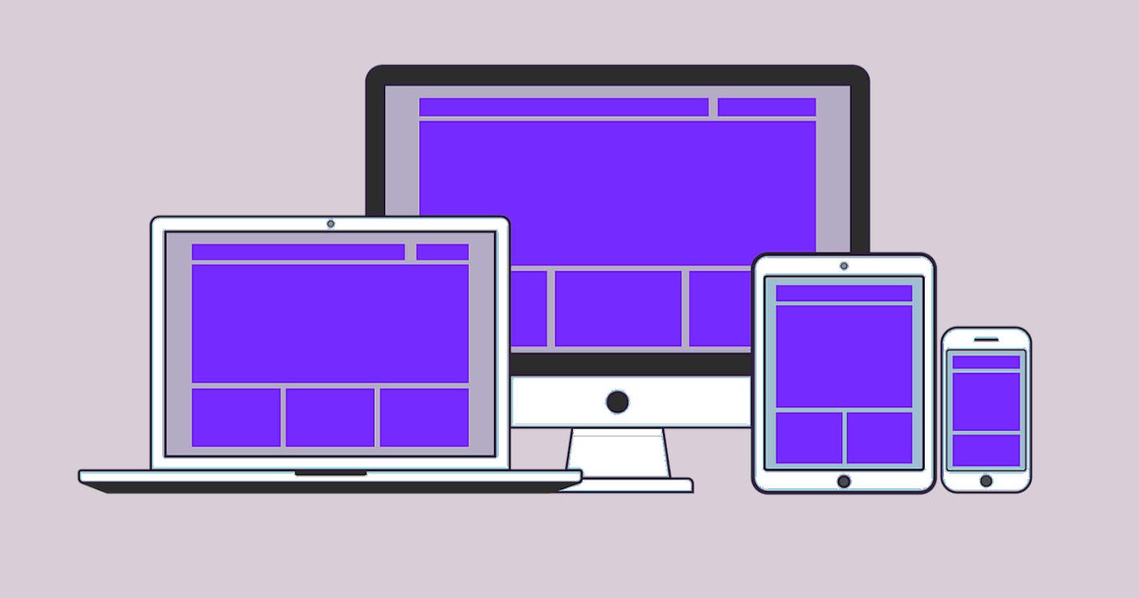
Media queries are an important aspect of modern web design. They allow you to apply different styles to a web page based on the characteristics of the device that is being used to view it. In this blog, we will discuss media queries and their properties in detail.
1.What is a Media Query?
A media query is a CSS technique that allows you to apply different styles to a web page based on the characteristics of the device that is being used to view it. This includes characteristics such as screen size, resolution, orientation, and color depth.
Media Query Syntax The syntax for a media query is simple. It consists of the @media keyword followed by one or more conditions enclosed in parentheses. The conditions are written in the form of a media type and one or more expressions that define the characteristics of the device.
@media media-type (expression) { /* CSS styles go here */ }
The media-type specifies the type of device that the styles will be applied to, such as screen, print, or handheld. The expressions define the characteristics of the device that the styles will be applied to. For example, you can define the minimum and maximum width of the screen, the orientation of the device, and the color depth.
Media Query properties There are several properties that can be used within a media query to define the characteristics of the device. These properties are as follows:
1.Width
The width property specifies the minimum and maximum width of the viewport. You can use this property to apply styles to different screen sizes.
@media screen and (min-width: 768px) and (max-width: 1024px) { /* CSS styles go here */ }
In this example, the styles will be applied to screens that have a width between 768 pixels and 1024 pixels.
2.Height
The height property specifies the minimum and maximum height of the viewport. You can use this property to apply styles to different screen heights.
@media screen and (min-height: 600px) and (max-height: 800px) { /* CSS styles go here */ }
In this example, the styles will be applied to screens that have a height between 600 pixels and 800 pixels.
3.Orientation
The orientation property specifies the orientation of the device, either portrait or landscape.
@media screen and (orientation: landscape) { /* CSS styles go here */ }
In this example, the styles will be applied to screens that are in landscape orientation.
4.Aspect Ratio
The aspect-ratio property specifies the aspect ratio of the viewport.
@media screen and (aspect-ratio: 16/9) { /* CSS styles go here */ }
In this example, the styles will be applied to screens that have a 16:9 aspect ratio.
5.Color
The color property specifies the number of bits per color component that are available on the device.
@media screen and (min-color: 8) { /* CSS styles go here */ }
In this example, the styles will be applied to screens that have at least 8 bits per color component.
6.Resolution
The resolution property specifies the resolution of the device, in dots per inch (DPI) or dots per centimeter (DPCM).
@media print and (min-resolution: 300dpi) { /* CSS styles go here */ }
In this example, the styles will be applied to printed documents that have a resolution of at least 300 DPI.
7.Device-Width and Device-Height
The device-width and device-height properties specify the width and height of the device screen, respectively.
@media screen and (min-device-width: 320px) and (max-device-width: 480px) { /* CSS styles go here */ }
In this example, the styles will be applied to devices that have a screen width between 320 pixels and 480 pixels.
8.Device-Pixel-Ratio
The device-pixel-ratio property specifies the ratio between physical pixels and device-independent pixels (DIPs) on a device.
@media screen and (min-device-pixel-ratio: 2) { /* CSS styles go here */ }
In this example, the styles will be applied to devices that have a pixel ratio of at least 2.
9.Grid
The grid property specifies whether the device supports a grid-based layout system.
@media (grid) { /* CSS styles go here */ }
In this example, the styles will be applied to devices that support grid-based layout systems.
10.Pointer
The pointer property specifies the type of pointing device that the user is using.
@media (pointer: coarse) { /* CSS styles go here */ }
In this example, the styles will be applied to devices that use a coarse pointing device, such as a finger.
11.Hover
The hover property specifies whether the device supports hover effects.
@media (hover: hover) { /* CSS styles go here */ }
In this example, the styles will be applied to devices that support hover effects, such as desktop computers with a mouse.
12.Conclusion
Media queries are a powerful tool that allow you to create responsive web designs that adapt to the characteristics of the device that is being used to view them. By using the properties outlined in this blog, you can create complex and sophisticated layouts that are optimized for a wide range of devices and screen sizes. When used correctly, media queries can help to improve the user experience of your website and ensure that it looks great on any device.
So thats all for today, hope you liked it. Will be covering more concepts in the forthcoming blogs.
Stay Tuned !